Contents
Systematic Testing: Results
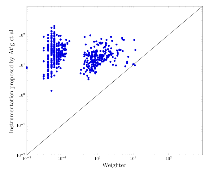
The following scatter plots and average times below summarise the execution time results for CBMC. Details for each litmus test are found in the xls table here.Scatter plot comparing all accesses instrumentation and optimised instrumentation using weighted selection under TSO
In average, the verification with CBMC of litmus tests instrumented with weighted selection is x333.6 faster than litmus tests whose all accesses are instrumented, as proposed by Atig et al..Reading the scatter plot (click for an enlarged version): the x-axis takes the execution time (in logarithmic scale) of running CBMC on an all accesses instrumented program. The y-axis has execution times (in logarithmic scale) for the optimised instrumentation. Any dot in the scatter plot is one benchmark instance, with x and y-values as described above. Therefore any dot below the diagonal line marks a case where all accesses instrumentation is slower than the optimised one. We observe that a large number of timeouts occurs with all accesses instrumentation, whereas only few such cases are found in optimised instrumentation using weighted selection.
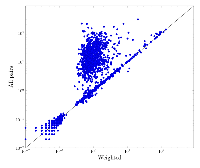
Scatter plot comparing full instrumentation and optimised instrumentation using weighted selection
The table below summarises the average speed-up per architecture when comparing CBMC applied on litmus tests transformed with a full instrumentation (i.e., instrumenting all the pairs in each cycle) to first CBMC applied to litmus tests where only one pair per cycle is instrumented, and then to CBMC applied to litmus tests modified by the instrumentation with weighted selection.| architecture | TSO | PSO | RMO | Power/ARM |
| speed-up full vs. one-event-per-cycle | x3.0 | x5.5 | x9.8 | x21.1 |
| speed-up full vs. weighted | x3.6 | x7.5 | x11.0 | x23.3 |
Reading the scatter plot (click for an enlarged version): the x-axis takes the execution time (in logarithmic scale) of running CBMC on a full instrumented program. The y-axis has execution times (in logarithmic scale) for the optimised instrumentation. Any dot in the scatter plot is one benchmark instance, with x and y-values as described above. Therefore any dot below the diagonal line marks a case where all accesses instrumentation is slower than the optimised one. We observe that a large number of timeouts occurs with all accesses instrumentation, whereas only few such cases are found in optimised instrumentation using weighted selection.